Low Carbon Websites are Better Websites
Lessons from our new website in what becomes possible when you aim for low-carbon, and what it takes to get there

At Something More Near we’re excited by the possibility of a post-carbon future. Through our work with coalitions building mass citizen movements, forward thinking companies and big players looking to re-imagine their role in the world, we know that imagination is the way to build a better future. So when it came to re-launching our website this year, we knew for sure that our new site could not simply be business as usual.
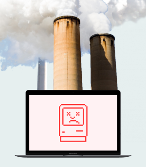
In response to the internet consuming more energy annually than the entire UK, there is a growing movement to build a more considered and responsible web. From agencies to magazines to art collectives, each have taken diverging digital paths to address their environmental impact. But at the start we didn’t know what it practically meant for us.
Over the last few months we’ve been working with a great set of partners to imagine and now launch a new site that is happily amongst a growing number of careful low-carbon websites out there. It’s not the flashiest or the biggest, or even the smallest, but in getting there we’ve learned a number of ways of working for web design and beyond that we think provide some clues to a more imaginative and, crucially, more fun low-carbon future.
It’s the energy, stupid
The first thing we had to acknowledge was that there’s no one magic solution to the carbon emissions of the internet. Websites inherently span multiple services, providers and users across the world. So the impact of a website can be much harder to quantify than a fixed physical thing. Making one is a process that must extend beyond simply choosing the right suppliers and into much bigger decisions about your actual requirements. If it seems too simple at the outset it’s probably not that effective.
What really helped was establishing what was actually inside and outside our control and transforming these into guiding principles for our design. We agreed to transfer our existing website onto a low-carbon hosting platform but also realised that the impact would be marginal due to the variety of energy sources our visitors worldwide used. It became clear that the best objective was to reduce the size of our site – the total amount of data that gets transferred whenever someone visits. Put simply, reduce the size and you reduce the amount of power required by your hosting, data transfer and your users’ devices.
Setting this clear goal meant we could clearly prioritise what was important to us and our visitors. If you’re not starting from scratch on a site, then understanding what’s in your control can lead to immediate improvements today.
Look at the whole system
Once we had established the fundamentals of our approach we began to explore what this would mean systematically for our site. Like any meaningful approach to sustainability, it would be no good to design things as normal and then optimise them at the end stage. We drew different connections between user needs, content structure, interfaces and sketched prototypes in order to make informed decisions about what was really necessary for us.
What this meant, in effect, was avoiding a whole lot of bloated bad practices that purely visual design tends to create on the modern day web. Seamlessness and abundance come at a price – endless scrolls, filters and carousels generally mean loading lots of things that never be seen, resulting in a lot of redundancy and needless energy use. Alongside this, long pages, heavy use of scripts and multiple web fonts are big offenders behind heavy resource use. On our site everything that’s in there is now a conscious decision. Amongst other choices, we use just one font in one weight, no Google analytics, no multi-image carousels, and extremely limited use of video.
It also meant avoiding heavy case study content with lots of video and images. Initially these seemed vital to us as an agency but the more we reflected on case studies, we realised that they use up a lot of energy (carbon and otherwise) for a very limited group of people. So we reduced bandwidth by making these available offline for those that really need them and refocused the blog on bigger, better stories for a wider audience, justifying the energy and the time. End result = more personal and meaningful reflections on our work.
Possibilities instead of constraints
What we’ve mentioned so far might sound like a long list of constraints and many different ways of saying no. But from much of our work exploring a post-carbon future with others, we know that the smartest organisations are the ones who can use this tension to move into new territories rather than simply trying to do the same but with less. For us this web project was a distinct opportunity to explore what a modern digital ‘post-carbon aesthetic’ could be online.
For design this requires a mindset shift from digital being a tool that allows you to do anything you want, to being a medium with its own specific qualities and quirks. Think of it like Louis Khan’s “what do you want to be, brick?” philosophy of material integrity versus a contemporary fascination with pouring tonnes of concrete in order to plant a few trees. If you follow the former approach and go with the grain you’re going to end up somewhere far more interesting.
In our case it has meant coming up with a number of distinct elements that go with the grain: animations based purely around text, high impact filtered images for low resolution formats, and a design system that deliberately accentuates high contrast, flat style layouts.
Good for one, good for many
So finally, what did we achieve in the end? Well, in pure numbers terms we now have a homepage that transfers approximately 80% less data than the average website, and more than 90% smaller than the average webpages of comparable industry peers. Each visit to this website is estimated to produce 0.16g of carbon compared to an average of 1.76g worldwide. We are also hosted using 100% renewable energy at a data centre in Iceland to best serve the majority of our visitors who come from the UK, USA and mainland Europe.
Beyond the numbers though we truly believe this approach is better for everyone. Much like the Microsoft approach of inclusive design – solve for one, extend to many – designing for low energy has outsized benefits. Not least because, as we’ve seen, the low carbon way is often the simplest, meaning more time to focus on the things that are most important for your business and the planet.
Shout outs
Big thanks to our collaborators HeyLow, Pyka and Giulia Garbin for equal parts technical expertise and creative excitement to help us get to where we wanted to be.


